When we first start working with most churches, they come to us with a logo and little else in the way of a visual design language. A single mark, sometimes created years ago, expected to carry the entire weight of their visual identity. So it’s no wonder that their church community members aren’t passionate advocates of their church’s brand.
Our Creator didn’t just make one element of creation and call it finished. He crafted an immersive, multi-sensory world with incredible depth and diversity — all working together in harmony to reflect His nature. Shouldn’t your church’s visual identity do the same?
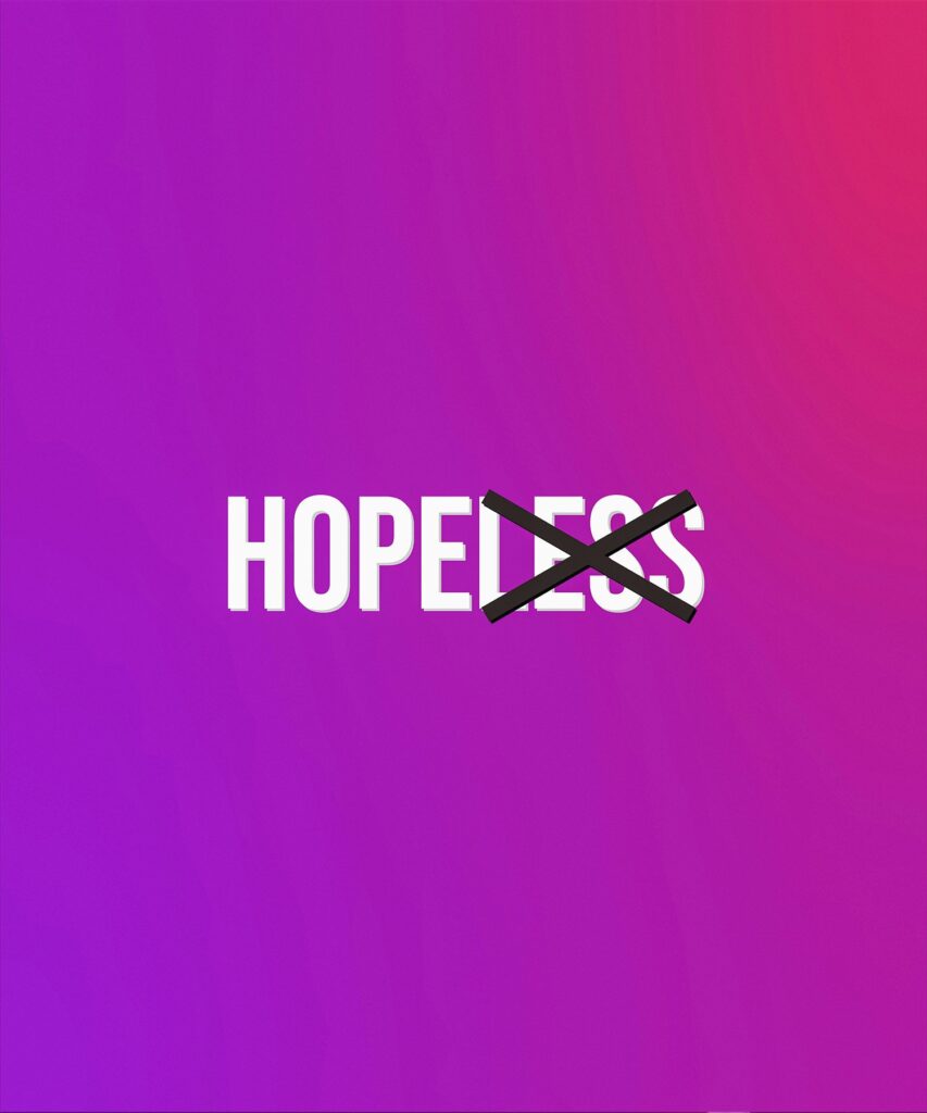
The Say-Do Gap in Church Branding
Pain Point: When a church claims to be a vibrant, welcoming community that values excellence while presenting a thin, inconsistent visual identity, it creates a Say-Do Gap. This disconnect between what you say your church values and what you visually communicate undermines trust and engagement, especially with younger generations who are highly attuned to authenticity.
Solution: Develop a comprehensive visual identity system that extends far beyond your logo — one that’s consistently applied across all touchpoints and genuinely reflects your church’s unique character, beliefs, and community.
Outcome: When this Say-Do Gap is closed, your visual presence becomes a powerful extension of your ministry, creating an emotional connection that strengthens belonging, increases engagement, and makes your community proud to identify with and share your church with others.
Key Takeaway: A church’s visual brand should be so much deeper and more powerful than just a logo. It needs a thoughtful art direction that adds character and visible attributes that people within your community can align and associate with.
“In the beginning, God created the heavens and the earth.”
— Genesis 1:1
Your church’s visual identity should be fresh and modern enough to appeal to younger Gen Z and Millennial audiences, but it must be so much more than just a logo. A complete visual identity system includes:
This visual identity system should be applied consistently and effectively across all audience touchpoints — from your website and social media to flyers, signage, and environmental design. Each element should work together to tell a cohesive story about who you are as a church community.
Effective church branding goes beyond technical elements to establish a distinct creative territory — a conceptual theme that guides visual choices and ensures your church’s unique character shines through. Think of a creative territory like a mood board on steroids.
Here are some key details about the creative territory process:
Going through this creative territory process will help ensure that every visual element feels unmistakably like your church – and it will put a big smile on the faces of your creative team.hese real-life problems represent opportunities for your church to provide targeted support and hope.
Churches that effectively leverage thoughtful and strategic brand art direction across all marketing communications experience tangible benefits:
When your visual identity system is fully aligned with your church’s belief and purpose, it becomes more than decoration — it becomes a powerful extension of your ministry itself.
Let’s be blunt: your church absolutely cannot afford to continue with the one-size-fits-all approach. It’s A church’s visual brand should be so much deeper and more powerful than just a logo. It needs a thoughtful art direction that adds character and visible attributes that people within your community can align and associate with.
Self-Assessment Questions:
How BLVR Has Helped Churches Close This Gap
At BLVR, we’ve helped churches like Bay Hills Church develop comprehensive visual identity systems that authentically express their beliefs. By guiding them through our Say-Do Gap® Method, we uncovered their core conviction and translated it into a visual language that resonates deeply with their community.
The result wasn’t just a refreshed logo but a complete visual identity system that embodies their belief that “Jesus brings dead things to life” through every visual touchpoint. From their “Come To Life” tagline to their photography direction capturing authentic transformation, Bay Hills now has a visual identity that truly reflects who they are and what they believe.When your visual identity becomes a genuine extension of your belief, it stops being mere marketing and starts becoming ministry.